
Better Brand Text for Food Blogs, Recipes and Restaurant Reviews
Food writing is sensory, but food websites are still built from text. A reader might arrive for a Yorkshire pudding recipe, scan a restaurant review before booking Sunday lunch, compare a product recommendation, or save a travel-and-food guide for a weekend in Yorkshire. Photography creates appetite, but the words tell people what to cook, where to go, what to order, and what to trust.
That is why brand text deserves the same attention as photography, recipe testing, and review integrity. On food blogs, typography is not just a styling layer. It is the system that makes ingredients, timings, prices, place names, ratings, disclosures, and personal storytelling easier to follow.
This article uses a different lens: the menu test. If a type system can make a menu, a recipe card, a review note, and a local food guide easy to read, it is likely strong enough for a modern food publication.
The Menu Test
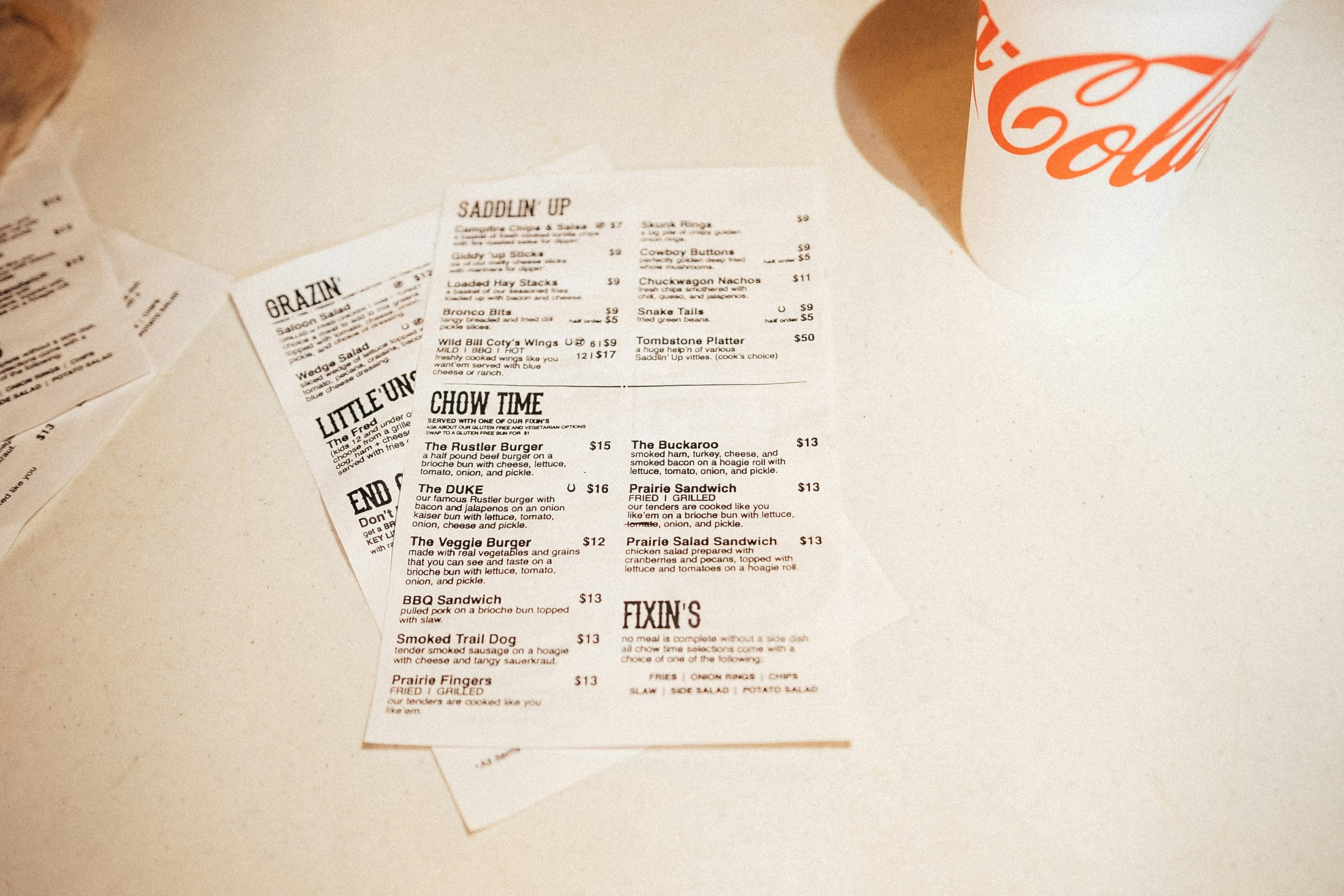
A good menu is a compact information system. It has names, descriptions, prices, dietary notes, sections, sometimes origins, and often a brand voice. A food blog works in a similar way, only across more page types. The same visual system may need to support recipes, reviews, product features, travel guides, event posts, and newsletters.
| Food page | What readers look for | Text problem to solve |
|---|---|---|
| Recipe | Ingredients, timings, temperatures, quantities | Numbers and steps must be impossible to miss |
| Restaurant review | Atmosphere, dishes, service, price, location | Opinion and practical details need separation |
| Product feature | Use case, cost, benefit, drawbacks | Claims need clear evidence and labels |
| Food travel post | Places, routes, opening times, booking notes | Names and logistics need scannable structure |
| Newsletter | Quick highlights and links | Headlines must work at speed |
The menu test asks a simple question: can someone find the useful detail without losing the flavour of the writing? If the answer is no, the type system is doing too much or too little.
Recipe Cards Behave Like User Interfaces
A recipe card is closer to interface design than many writers realise. Readers do not only read it once from top to bottom. They move between the ingredient list, method, oven temperature, prep time, notes, substitutions, and comments. Some are cooking with wet hands. Some are reading from a phone propped against a jar. Some are making the dish for the first time and need reassurance.
Ingredient amounts, oven temperatures, timing, and serving sizes need reliable numerals. Instructions need enough spacing. Notes should not look like the main method unless they are truly part of the process. For a classic dish, clarity matters even more: a reader making Yorkshire puddings wants confidence about hot oil, batter texture, oven timing, and when not to open the oven door.
Restaurant Reviews Need Evidence, Not Just Atmosphere
Restaurant reviews depend on trust. A food writer may describe a room, a welcome, a wine list, a main course, a dessert, and the feeling of the meal. But readers also want evidence: location, price range, booking details, standout dishes, service notes, accessibility, and whether the experience matches the recommendation.
The best review layouts let atmosphere and evidence sit together. Storytelling can lead the piece, while captions, short verdicts, and practical notes help readers act on it. Disclosures should be legible and consistent, not hidden in tiny type. A review can be warm and personal while still making the practical details easy to find.
A Food Brand Needs More Than One Voice
Food publishing moves between warmth and utility. A recipe introduction may sound personal. A restaurant review may feel conversational. A product feature may need a more careful tone. A printable shopping list should be almost invisible in its design because the task is practical. A useful food type system usually includes:
- a display style for headlines, section openers, and campaign graphics;
- a text style for recipes, reviews, captions, and guides;
- a numeric style for temperatures, prices, dates, weights, scores, and serving sizes;
- a label style for dietary notes, locations, categories, and disclosures;
- an accent style used sparingly for quotes, badges, or short editorial moments.
Food is emotional, but readers still need information to behave predictably. Good typography lets both needs exist on the same page.
The Pantry Shelf: Choosing the Right Kind of Font
Font sourcing is like stocking a pantry. Free fonts can be useful for early experiments. Commercial fonts offer more reliability for professional work. Variable fonts can help responsive websites. Custom fonts make sense when a brand needs distinctive recognition across many touchpoints.
Food publishers, restaurant groups, and culinary brands comparing commercial families, variable fonts, or custom type systems can review foundries such as TypeType when they need typography tested across websites, menus, recipe cards, packaging, newsletters, and campaigns.
For a food publication, the practical question is not whether a font looks charming in a single header. The question is whether it works in the places where readers make decisions: recipe instructions, dish names, location details, dates, prices, and downloadable resources.
Licensing Belongs in the Production Checklist
Font licensing is easy to overlook because fonts feel like creative ingredients. Legally, fonts are software. A licence defines where and how a typeface can be used. Food publishers and hospitality brands may use the same font on a website, printable recipe card, newsletter, menu PDF, restaurant signage, packaging, social video, or sponsored campaign.
| Use case | Licensing question |
|---|---|
| Website | Can the font be embedded as a webfont? |
| Printable recipe card | Can the font be embedded in a PDF? |
| Restaurant menu | Are commercial print uses covered? |
| Logo or blog masthead | Is wordmark use permitted? |
| Packaging or labels | Can the font appear on commercial products? |
| Social ads and video | Are campaign and motion uses covered? |
| Templates | Can editable files be shared with readers or clients? |
| Contributors | Can font files be shared with freelancers or agencies? |
Common Mistakes on Food and Recipe Sites
Food websites often go wrong when atmosphere outruns usability. A typeface can look beautiful over a rustic table photograph and still fail inside a recipe card or review note. Watch for these issues before publishing:
- using script fonts for ingredient lists, timings, or restaurant details;
- making captions too small under important food photography;
- choosing unclear numerals for oven temperatures, prices, weights, dates, or serving sizes;
- placing pale text over busy images of food or interiors;
- mixing too many fonts across recipes, reviews, newsletters, and social graphics;
- hiding sponsored or gifted-meal disclosures in tiny type;
- using personal-use fonts in monetised content or commercial menus;
- forgetting accents and local place names when covering travel or restaurants.
A Compact Workflow for a Food Blog Redesign
Instead of redesigning every page from scratch, test typography against four real content samples: one recipe, one restaurant review, one product feature, and one newsletter. This quickly reveals whether the system can handle the publication’s real work.
Collect real text first: recipe titles, ingredients, method steps, prices, dish names, locations, and captions. Then test the font in mobile recipe cards, check numerals for temperatures and prices, create separate styles for headings, body text, labels and captions, print one sample recipe card, confirm licences for web and print, and document the rules so future posts do not invent a new style every time.
Food blogs work best when they feel generous: generous with flavour, experience, evidence, and practical help. Typography supports that generosity by making the useful parts easier to find.
A good type system should not make a food publication feel sterile. It should make recipes easier to cook, reviews easier to trust, and restaurant stories easier to act on. If the menu test works, the rest of the brand usually becomes easier to serve.